For designers
A visual playground that ships safely
Build colour, type and space by eye, see it on real components in every mode, and send it out with a review behind it.
- Step
- 600
- #5b4bd6
- On white
- Body text 6.1:1
- Dark step on night
- Large text only 4.0:1
Pick a seed. Everything on this page follows it.
Design tools
Build the foundations by eye
Pick a few things. See the whole scale, light and dark, before you apply it.
- 4xl
39.81pxLarkspur - 3xl
33.18pxFoundations - 2xl
27.65pxGrow it by eye - xl
23.04pxGrow it by eye - lg
19.2pxGrow it by eye - base
16pxReadable at every size, light or dark. - sm
13.33pxReadable at every size, light or dark.
A palette from one colour
Light and dark ramps in OKLCH, and every step says what text it can carry.
Design tools on TokensA type scale in a minute
Pick a ratio and see it on real text. Fluid between two widths, if you like.
Spacing that snaps
T-shirt, linear or geometric, on your grid.
Dark gets its own values
Edit Dark in Dark. Light never notices.
Brand Book
Guidelines people actually open
This is the real Brand Book, drawn live for a sample brand. Try each layout, and Dark.
Editorial. A cover, then a long magazine read.
Five layouts, one book
Docs, Editorial, Board, Chapters or Spec sheet. Readers can switch if you let them.
See the Brand BookArranged your way
Drag sections, choose each one’s view, Comfortable or Compact.
Never out of date
Every release rebuilds it, in your own tokens.
Public when you’re ready
Make it public and your Community page becomes the book.
Icons & Logos
Every icon and logo, in one place


Bring a whole icon set
Lucide, Material, Heroicons, Phosphor, Font Awesome and more, from a link.
See Icons & LogosLogo sets for every use
Web, Print, Social: each logo on the background it’s made for.
A favicon pack in one click
favicon.ico, the Apple touch icon and web app sizes, made in your browser.
Released like tokens
Add one, it’s a minor. Remove one, it waits for a reviewer.
Figma
Stay in Figma. Stay in step.
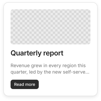
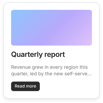
Faithful from 90%Close from 70%
- Tokens
- 4 of 4 found in this Brand
- Values on tokens
- 4 of 22
- Most of the gap
- the photo
Measured by the Review’s own code on the Card in Stoaken’s Figma test file. Figma sent a photo; until one is uploaded Stoaken draws a placeholder, and the score says so.
Variables, both ways
Approved releases land as Figma variables. Your edits come back for review.
The Figma pluginComponents that look right
Auto layout, styles, text and variants, carried over property by property.
A score, not a promise
Each one measured against Figma’s own picture, with a score.
Icons, both ways
Your icons arrive as Figma components. Figma icons come back for review.
Your way of working
A workspace that starts with the design
The Creative view
Your colours, Brand Book, icons and components first. Developer tools wait lower down.
Choose a viewA short tour on every screen
Spotlight shows what each part does, once. Turn it off any time.
Move fast before 1.0
With velocity, only breaking changes wait for review.
How velocity worksBring everyone in
Reviewers and viewers are always free.
Design it by eye. Ship it with a yes.
Free for two editors. Reviewers and viewers are always free.